The SKULLY mobile application was designed for both iOS and Android, with slight variations based on the individual platform differences.
This was a nice tight team of 3 people: myself, another designer, and our android developer.
Luckily all three of us were riders and motorcycle enthusiasts which made for a great experience where we were all testing and riding our designs as soon as we had something working. This allowed for an extremely tight feedback loop and helped us discover where ideas that looked great on paper, failed in the real world. We built the Android version first, as it was faster for us to experiment and develop on, and then used the completed Android version as the guide for iOS.
- Role: VP Product
- Team Size: (3) 1 Visual Designer, 1 Android Developer
- Company: SKULLY
- Time Period: Late 2015
Big thanks on this project to the inimitable talents of designer Jeff Broderick and the Android talents of Chris Koessler
Click the images to learn more.
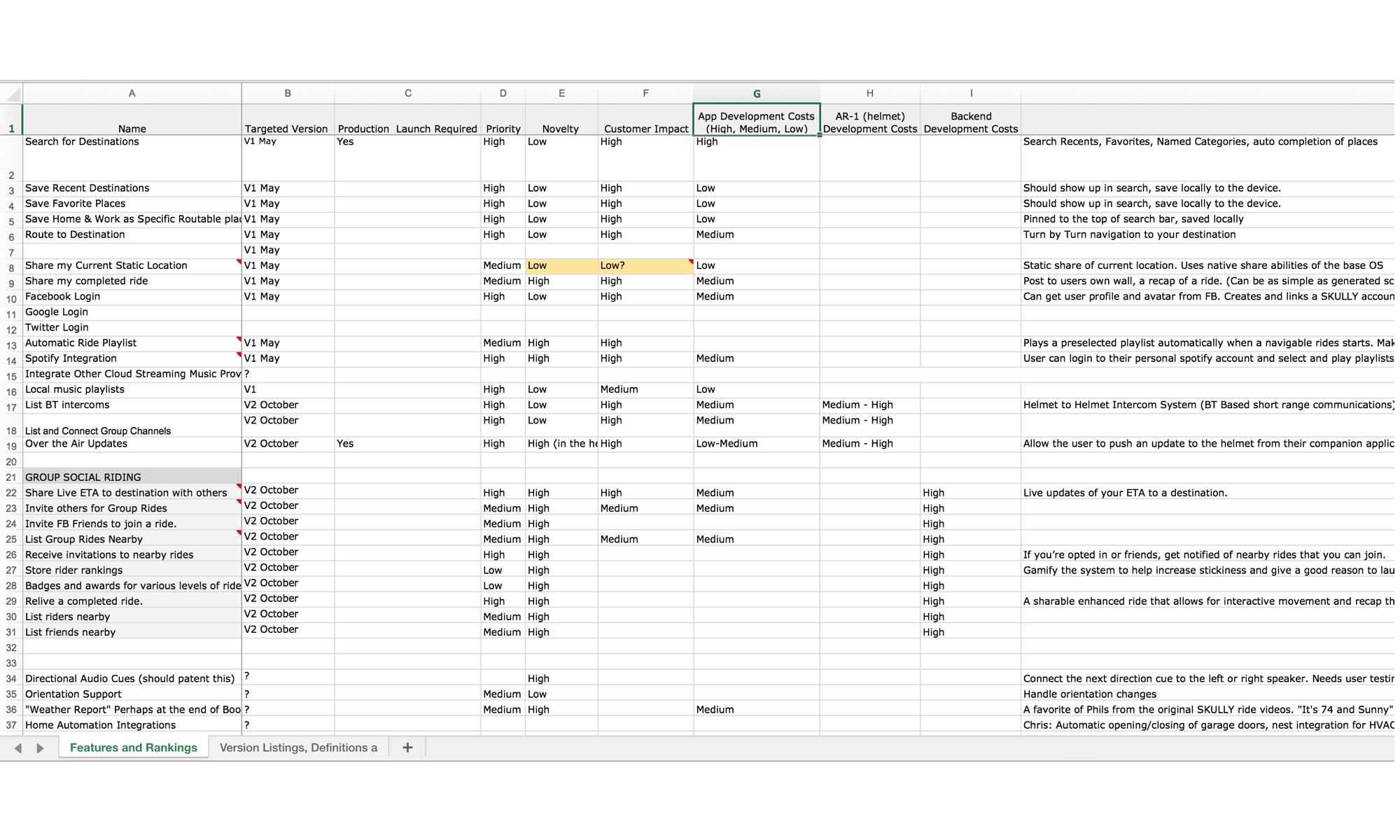 Feature & version planning and priority spreadsheet. This might be the least glamorous part of building software, weighing the tradeoffs and resources to decide what to tackle next.
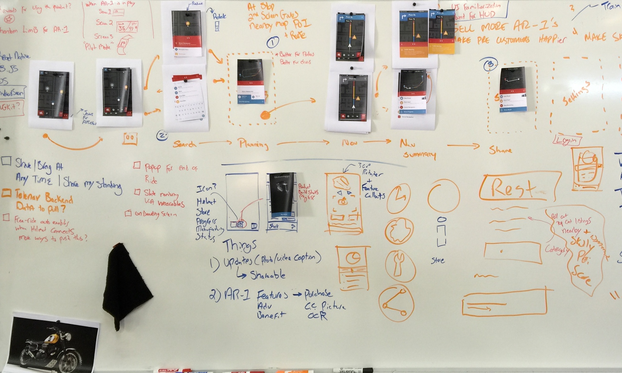 Beginning to map visually designed screens to the whiteboard based flow. One of my favorite things to do is to combine detailed digital design, with the flexibility of whiteboards to really understand complicated user flows.
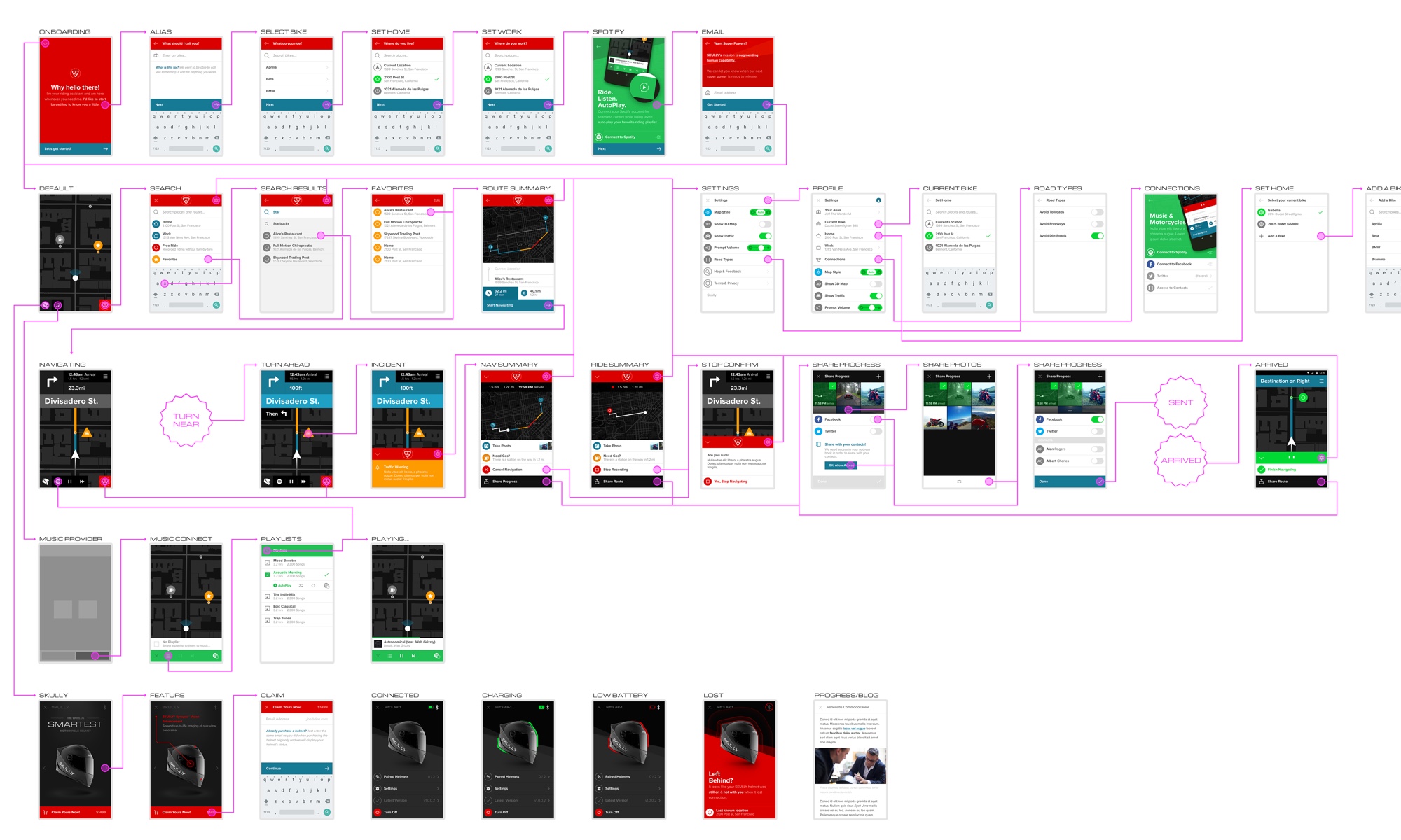 As the app takes shape, the digital documentation begins to be fully formed.
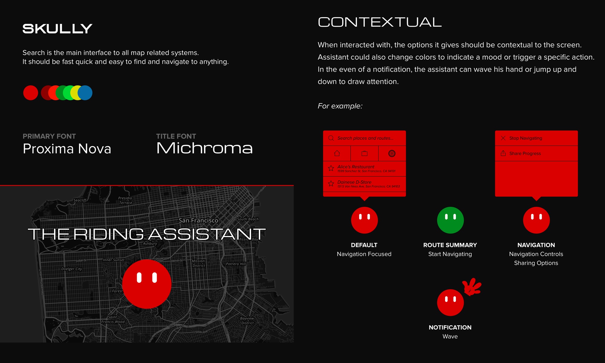 This ‘Style tile’ helped us hone in on the visual style and gain an early feel for the overall application. I use these to help gain executive buy in, without having to fully design out all screens.